Port of Blyth has undergone a rebranding process to support its growth and reflect the modern organisation it has developed into in the last five years.
Having worked with leading North East design agency El Roboto, the Port have launched a new, updated version of its logo as well as a suite of new materials for internal and external use – from exhibition stands all the way through to business cards.
Port of Blyth’s PR & Communications Manager Tom Chaplin, said: “After two record years in a row in terms of turnover and profits, rebranding whilst we’re growing makes a lot of sense. The old brand originated in the 1990’s, so now is the perfect time to move the Port of Blyth brand forwards and ensure it accurately reflects the organisation we’ve become.”
The Port will now begin a process of rolling out the new branding across its five terminals: on to buildings, across a range of signage and onto staff clothing.
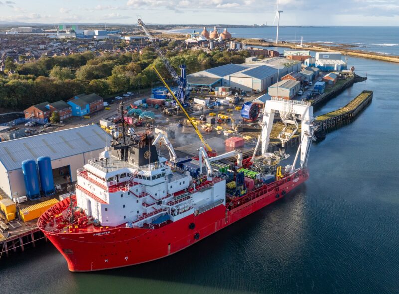
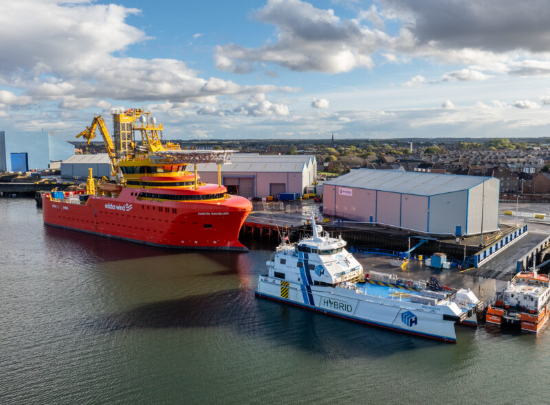
Having achieved a record turnover of £22m in 2016 and increasingly being seen as the offshore energy supply base for the North East, it was felt that the new branding would help to attract new customers at a time when development sites within the port and elsewhere on the estuary are reaching key milestones in their development.
The previous logo had been in use for more than 20 years – having been introduced for use alongside the Blyth Harbour Commission’s well known crest (above, right) in 1995 – and was recognisable for its nautical blue colouring and distinctive stars motif. The new logo recognises the heritage of the original, retaining both the ‘port’ blue colour and the stars, whilst offering a fresh, clean version that is both future-proof and highly recognisable.